A beginners guide to Seaborn in Python

Just like the famous Matplotlib, Seaborn is a statistical plotting library for python and is, in fact, built upon it.
Seaborn is more a styling library than adding more features. Allowing for breathtaking graphs with an amazing API.
Getting started
Before getting deep into this library, we need to install it. To do that you will need to have python 3.4+ and run the following command to install it via pip.
pip install seabornOnce the installation finishes you import the library in your python script. The alias of sns is used to identify the library.
Importing the library
You can use the following code to import it using the alias discussed above.
import seaborn as snsThen, using a library like pandas, is possible to load a Dataframe into Seaborn. For this example we will be using the IRIS dataset that we actually used in a previous deep dive (Support Vector Machine And Python).
Loading the dataset
We load the dataset simply by issuing the load_dataset function of Seaborn. Here is an example of how it can be done.
dataset = sns.load_dataset("iris")Here, data will be actually a Pandas Dataframe and we can confirm it using the built-in function type to check its type.
Knowing what type is data gives us the power to use Pandas to manipulate the data how we want.
Now that we have the package installed and the dataset loaded we can finally get into some beautiful graphs.
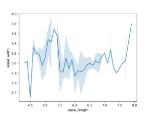
We have several options of graphs we can do, one of those is the lineplot. Which can be issued with a simple line of code and, given the column names of the dataset for the X and the Y axis, it creates a graph.
Something like this.
import seaborn as sns
import matplotlib.pyplot as plt

dataset = sns.load_dataset("iris")
sns.lineplot(x="sepal_length", y="sepal_width", data=dataset)

plt.show()
That gives us the following result.
Using matplotlib to stylize even further
Do you notice the plt.show() from Matplotlib? That is because since Seaborn is built on top of Matplotlib, it needs that call to display anything.
And that means that we can customize the graph using matplotlib itself. Let me show how.
For example, to add a title of the plot we can use the function below from the Matplotlib package.
plt.title("My Awesome Plot")But we could also set a limit on the axis or even overlap plots!
Conclusion
As we saw here, Seaborn really is an awesome tool for data science and presenting our work in a plot form.
Hope you liked this post. See you next time!